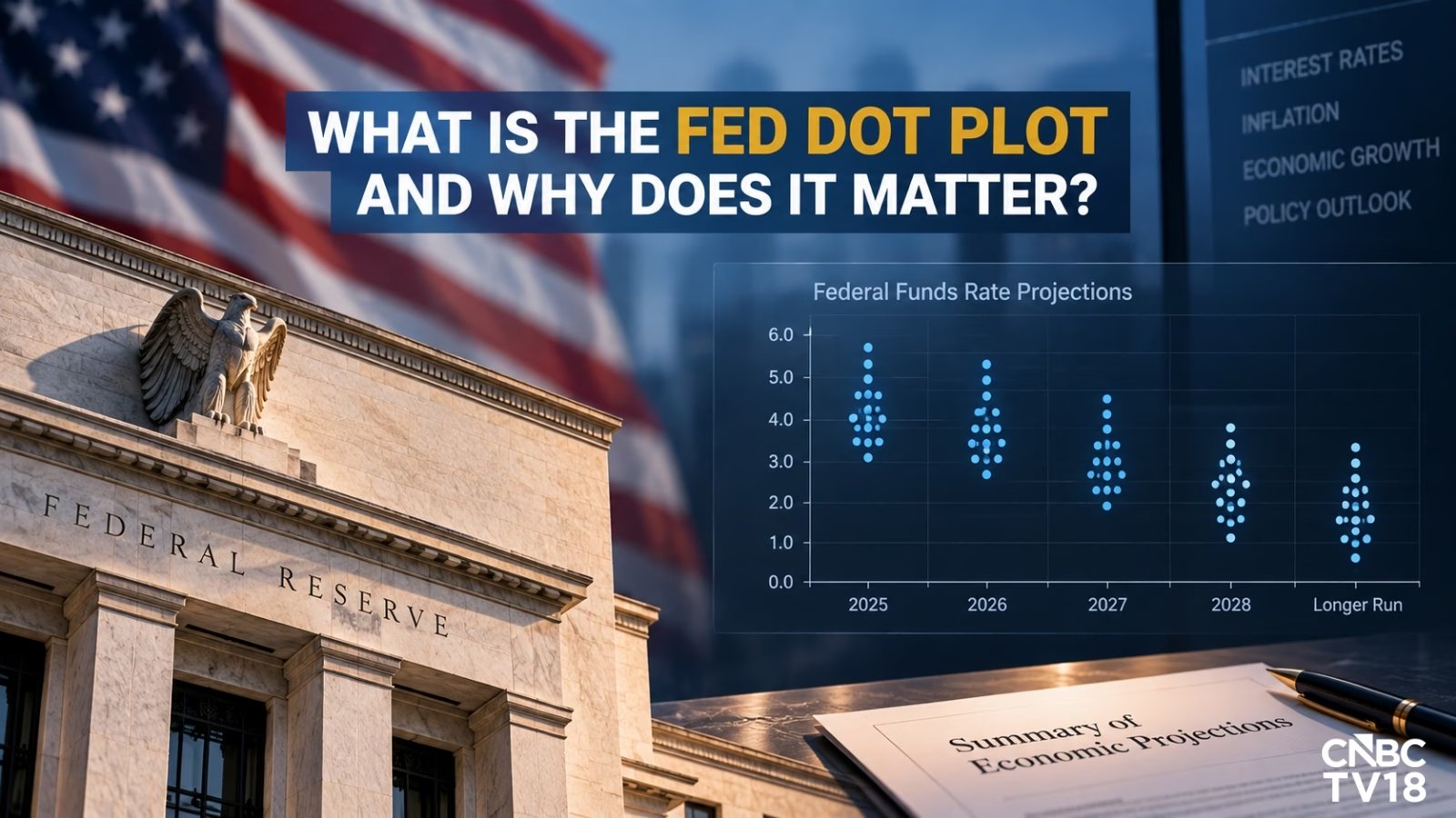
The Federal Open Market Committee (FOMC) is convening for its September 15-16 meeting, with the policy decision and press conference scheduled for September 16. But the real battle for market sentiment often plays out in the Summary of Economic Projections (SEP), specifically the dot plot. This chart maps where each of the 19 FOMC members individually expects the federal funds rate to land at the end of the current year, the next few years, and the long run. It’s not a consensus decision — it’s a collection of anonymous dots that can signal a shift in the Fed’s internal temperature far before the official statement drops.
Introduced in 2012 to boost transparency, the dot plot remains the closest thing to a preview of the Fed’s path. Each dot represents a single policymaker’s assessment based on their outlook for inflation, employment, and growth. The median — the middle dot when arranged from lowest to highest — typically grabs the headlines. If the median shifts higher, it signals hawkishness; lower, dovishness. Yet, savvy traders look beyond the median to the distribution. A tight cluster suggests consensus, while a wide spread indicates internal disagreement, often leading to volatility as markets debate which view will dominate.
This is where the dot plot diverges sharply from market pricing. Financial markets price in rate expectations via federal funds futures, a real-time, liquid market that adjusts instantly to new data. The dot plot is a static, quarterly snapshot of human judgment. Sometimes, the median dot sits well above or below the market-implied rate. That gap is where the opportunity — and risk — lies. If the Fed’s dots show fewer cuts than futures suggest, equities may sell off; if they signal more easing than priced in, bonds and growth stocks often rally.
For active investors, the dot plot is a check on the narrative. It strips away the boilerplate language of the Fed’s statement to show the raw, individual views of policymakers. It’s not a binding forecast — the Fed explicitly states these are not a Committee plan — but it’s the best available window into how the benchmark for US borrowing costs might evolve. With the SEP due on September 16, watch the median and the spread. The dots don’t lie, but they don’t tell the whole story either. The market will have the final word on whether the Fed’s internal math aligns with the economic reality.